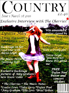
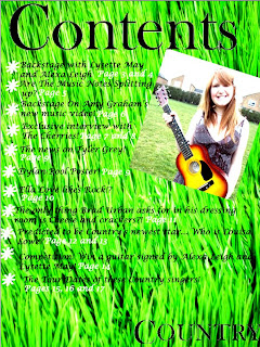
This is my finished music magazine. I created it using adobe photoshop. Creating this magazine and also doing the peliminary task which is the school magazine has helped develop my skills in both photoshop and blogger; from the first task right down to this evaluation.

1.In what ways does your media product use, develop or challenge forms and conventions of real media products?
The music magazine genre I chose was; Country. When I researched Country magazines on Google there were a lot of images that came up, I noticed quite a big thing that kept popping up though; they were all from the 1970's or 1980's. This is because in our days music like RnB and dance are the most popular genres now. When it came to the front cover I wanted to keep it quite simple because that's what the Real magazines do. They don't put any big fancy images or writing in, they keep it plain and simple. They let the articles within the magazine do the talking for them. So that's what I decided to do. The picture that I used on the front cover was of a girl twirling in a field wearing a long dress and cowboy boots. Now this is what I wanted to go for, I wanted to keep it stereotypical. If this is what people wanted to believe Country music is like then this is what they will see in the magazine. Also since the 1970's Country music has always been about cowboy hats and acoustic guitars, I wanted to continue and develop that stereotype in my magazine. Although, there is one thing that I chose to challenge; when I looked at the images of the Real Country magazines, I noticed that the people that were on the front cover were men. All of the people on my front cover and in my magazine are women. This shows that since the 1970's when these magazines were published, the music has widened to a different audience and different society who are actually in the business because back then it was mostly men. Now look how times have changed; it's 2010 after all.
2.How does your media product represent particular social groups?
There are two social groups represented in my music magazine; they are late teenagers to mid twenty's and Country music lover. When you see the images in and on my magazine, even though they are the artists they are still the same age as the target audience. It shows thats the teenage social groups aren't afraid to say what they like and what they don't and they like country music. It paints them in a good light considering the bad press and teens have been getting for so many years. The other social group would be; Country music lovers. Which are most likely to be as I said sixth form students or/and aspiring musicians. What the magazine says about them is they consider the better things when it comes to music and they like to be different. They don't want to be like everyone and do what they are doing. This is why I have added in a competiton to win an acoustic guitar signed by two famous musicians.
3.What kind of media institution might distribute your media product and why?
When it came to the kind of media institution that I wanted to distribute my magazine in, there were two major institutions that I looked at; Bauer and IPC. I researched both of these media institutions and first of all i considered Bauer because it is a big worldwide institution that distributes magazines to 15 different countries. Then I thought everyone of these county's are bound to have a Country music magazine but the UK doesn't. The IPC media is just national and not worldwide, it only publishes in the UK. This is why I went with IPC because my music magazine would take of here in the UK because there isn't anything like it; Country. So there is a big gap in IPC for it.
4.Who would be the audience for your media product?
My music magazine is a Country music magazine, so obviously like all other magazines they have to have an interest in the music genre that the magazine is. So to be interested in, read and buy this magazine they have to be interested in Country music. The gender that will most likely be interested in this magazine will be females. The reason it will most likely be women is because stereotypically boys/men are interested in either R&B, rock, punk or screamo and girls are known to like a softer music like pop. So country is more in the areas of the female presuasion because it is a softer sound and when you think country you imagine girls with long dresses, cowboy boots, acoustic guitars playing on fields. The ages of the audience that would read my music magazine are; 17-25 year olds. This is because these are years they are at Sixth form/college and University. They could be studying music at university or sixth form or they could even just be interested in music but not studying. They may just feel music is a way of escaping from they're busy schedules of university. Country music is a good way to express yourself because it is very REAL. It isn't really fake at all, mostly everything is acoustic in the genre. This is what they're occupations are most likely to be; university student or sixth form student. As I said before they most likely will be studying music in Uni or Sixth Form if they're are passionate about the music that they listen to; Country. They're interests would mostly likely be; REAL music, acoustic music. They will be quite smart and maybe a bit higher class to appreciate Country music. Also they will have a different taste of everything to alot of people they're age group. They will like to do things that are different to what everyone else is doing. They like to express the fact that they are different.
5.How did you attract/address your audience?
When it came to actually addressing and attracting my audience which as I have already established are; girls aged 17-25. So to attract them I put used things such as posters, concert stickers, exclusive interviews and competitions. I knew that if I put in that there was posters included of boys, the girls would want to buy it straight away because steriotypically girls are obsessed with boys and even more; male musicians. So this would attract them to buy the magazine. I knew that if I put that my magazine contained stickers the buyers would want it because everyone loves a freeby, this is because the magazine is worth the money because of the freebys inside it. Exclusive interviews were included because anyone who listens to music and in this case country music has to be interested in the artists and the new music involving them. So when it comes to seeing the magazine they might see a line from an article involving the band they like or just the bands name like for example on my music magazine; 'The Cherries.' Someone might see they're name and want to buy the magazine because they want to read that exclusive interview. Also if they are especially interested in Country music, the title; 'COUNTRY' will catch they're eyes and they will notice that it is a country magazine. When it came to the overall look of the magazine, I kept to Country colours like using grass and fields as background; keeping it very stereotypical. Also the clothes are stereotypical as well. If the audience likes Country music then they will be drawn to this magazine because it is obvious to what music genre it is because of the clothes and colour scheme.
6.What have you learnt about technologies from the process of constructing this product?
When it came to actually makeing the product on Photoshop at first I really didn't know what
I was doing. The only things I really knew how to do were; adding pictures in and cropping them. As I was going along I learned that it's not that hard using Photoshop. As time went on and I was using it almost everyday I picked up how to do something new and use different tools. Some of the new things I learnt how to do or change were; the effects of different pictures, the backgrounds, add text in with different fonts and colours and use the different tools in the side bar. If I was faced with another task involving Photoshop, I would be ready for it because of the things I have learnt involving using it for this task. The second technology I used was cameras; taking pictures for the magazine. Everyone knows that I am hopeless at using a camera. All you have to do is push one button and it done. I usually cut people's heads off, so I normally ask someone to take the pictures for me. I couldn't do this, this time because I had to take them myself. So I learnt how to actually take descent pictures and upload them to the computer as well. When I was using the camera, I was also thinking about the camera angles as well because this is what media has taught me to do over the years.
7.Looking back at your preliminary task, what do you feel you have learnt in the progression from it to the full product?
Looking back at the preliminary task which was; the school magazine I feel that more in all of the areas including; using cameras, camera angles and how to use Adobe Photoshop. When you look at my magazines the comparisons and differencies are definetly big and seeable. You can clearly tell which is the better one that I spent most of my time on. My music magazine is the best one because after using photoshop for the first task and using it for so long on the second task it got easier to use therefore made everything look better because I knew what I was doing. I feel that I have learnt how to use Photoshop properly and how to edit pictures and make a successful piece of work. I think that I learnt how to make things look better and more professional. Also how to manage my time more on it because on the first task I didn't manage my time very well, so I made sure I did on this task. So I didn't spend ages on just tweeking the small things. Since the first task I think I have used learnt more about camera angles and learnt how to use them in my work, even if I'm not even thinking about it. I think I have learnt that when I'm using a camera it's not just about taking the picture. It's making sure everything to do with the mise-ene scene is right too. Like the background and the clothes because when it comes to putting it on or in the magazine it has to go with the theme and even the colour scheme.
Feedback
We all wanted feedback on our magazine so a few of the class analysed my music magazine and answered a few questions on it. From these answers I found good points, bad points and improvements. A good point about the answers was the audience. All of the students that answered the questions all guessed the right target audience that I predicted to this means that this really would be the target audience of the magazine. Other good points were; good house style, bright exciting colours, consistant pictures and they stand out as well and the language suits the magazine as well. The bad points that kept popping up was; the text overlapping and the pictures looking too streched. So if I was going to make any improvements I would space the article out a bit more and not try as hard to make the picture bigger and fit on the page more.


