Thursday, 25 February 2010

Audience Profile of Hammer Magazine

For this task we have to write an audience profile for any music magazine that we looked at during our media lessons. I chose to look at the Rock music magazine; Hammer.

I think the particular age of the readers who read this magazine is 16+. This is because there are certain images and articles that under 16 year old's wouldn't really want to read and wouldn't find very pleasent. The articles and images may be old for them. It's like a 13 year old reading it; it's not for them. It's for the readers over 16 who like the lifestyle and maybe live it themselves. The particular gender of this magazine would mostly be male because the music is all about rock and roll, sex and drugs. This is what the music and lifestyle of the rock bands are based around. Just look at the magazine; there is a band with machine guns and explosions all around them. So stereotypically you would associate this type of bahaviour and music with men because they like anything violent, blood and gore and the idea of a rock and roll lifestyle. The most likely occupation of the readers that read; 'Hammer' is probably students at sixth form or college who like rock and roll. Or maybe the people who work at special rock places in towns for example like; The Sqaure in Harlow. There are like over 20 year olds who like rock and roll and who have that type of style, they would definetly read this magazine. Also teachers who teach students how to play the guitar and things like that, who adopt a particular style and like for rock and roll so they teach it through things like Rock School at The Sqaure. Also the type of people who like working backstage at gigs that low key rock bands play at, they just like to be around anything rock and roll. The interests of these people would most probably be going to rock concerts, playing the guitar or drums, being in a band, getting tatoos, piercings and anything rebelious really. The social class of people who read this magazine would be middle class. This is because the magazine isn't particulary expensive and you don't need much money. So the people who read this magazine aren't going to be upper class snobs, they will just be middle class musiicians or wherever they work who love rock music and the lifestyle.


So that is the audience for; 'Hammer' but how does the magazine target it's audience? Well, we know that audience are mostly men and most males like violence, explosions, fighting, guns and anything rebelious. So the magazine promotes this on the front page by making it as viloent as possibel. They put two men from a band looking very hard and muscly surrounded by explosions and using big machine guns. The colours are mostly browns, yellows and oranges so to show the explosions and fires. The magazine is telling the readers that you have to be hard and extreme to read this magazine. So it is almost saying you are girly if you don't read this magazine. The readers will think they need to buy this magazine in order to keep they're; 'manly' status. This method is very effective because it makes men think that they have to buy this magazine in order for them to keep they're status and to let everyone know they are extreme enough to read this magazine. Also with the magazine there are free gifts; a dog tag necklace, posters and a CD, because it is mostly middle class people who read this magazine they will love freebees because they know they don't have to pay through the nose for it, which they can't afford. Also the dog tag necklace represents the rock and roll atmosphere that readers love so much so they will want to buy this magazine. Also the posters are the bands that the readers listen to so if they see that the posters are in the magazine they will want to buy it. The magazine is appealing to the readers interests through the posters. Also the CD contains new bands for 2010, readers love finding and hearing new rock and roll bands so that's why they have put the CD in here. They love all of the freebees because this is stuff they wouldn't be able to buy normally, they couldn't waste they're money because they need it for more important things. But in this magazine you get; a dog tag, a CD and psoters for just £4.25 so readers can afford to buy it because they love a good bargain! On the magazine there are different bands mentioned on the front cover with little extracts from the articles under them, they have done this because the readers know these bands because some of them are rock and roll legends. So the writers of the magazine add these in because they know the readers will want to read the magazine if they're favourite rock bands are in it. But how will they know if they are in it? So this is why the magazine has the band names on the front cover so the readers can seen them and want to read the magazine. This is an effective method of targeting the audience because they have gone straight to they're interests; they're favourite bands and maybe the bands they want to aspire to and look up to.

Tuesday, 23 February 2010

Audience Profile: Nature magazine

My nature magazine is all about the waters of nature; so seas, oceans, waterfalls, rivers and lakes etc... So the main audience would be anyone who is interested in anything with nature and water. You can't exactley say which gender would like the magazine more but maybe more of the type who like to spend there time outside so to be stereo typical the gender that is aimed at through my magazine would be males. The ages that are targeted at would most likely be the ages that can see the the bigger picture of nature. So maybe retired older people who wish to see nature that they couldn't see when they were younger. The magazine isn't aimed at teenagers because they do not appreciate nature the way older people do. Also the readers of this magazine would be sophisticated people who appreciate nature and can afford to go out and visit the places within the magazine and that's why they can buy every issue as well. The readers of the nature magazine will also be interested in all different types of nature and have quite a lot of money. So to round it up really the readers are mainly; males over 50 with quite a bit of money and who like nature.

Wednesday, 10 February 2010

School Magazine Evaluation

Front Cover Contents Page


For this task I had to go around the school taking pictures of the school for a school magazine. Then I had to choose the simages, texts, colour and others things for the magazine. Now I need to evaluate what I have done. On the left you can see a picture. This is the front cover of my magazine. I will be evaluating the images, text, colour, logo and strengths and weaknesses. I will also be discussing the changes I would make and what I have learnt from this task.

Images


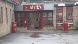
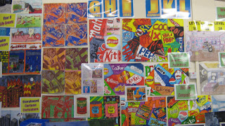
On my front cover of my magazine I have put 9 images from all over the school. I decide d to put this many to make it kind of a montage of what the school is like and the classes. I decided to put all of these pictures diagonal because it looked better this way and more artsy. Also it appeals to more people, more people would see it this way if there were less pictures and they were just straight and normal then the cover wouldn't catch the readers eyes. The first image on the left hand side of the magazine is of two drama students acting out a scene, readers can clearly see that these students are drama students. This is a good image to see on or in a magazine because readers can see St Marks offers a range of different classes and things. The shot is a medium shot because I wanted to keep in the whole of the scene to show the body language because they are of course acting. The second image is of a student b eing taught how to play the drums in a music room. Thisis an especially good picture to put on the magazine becuase it is showing that the school isn't just about the subjects like english or maths, it offers subjects that the students enjoy and love like; music. This shot is a high angle shot because I thought it would be a good idea to get the whole drum kit in and also to see him actually playing the drums, him looking down and playing the drums gives it more of an effect. The third image is of pupils in the libary on the computers, this is to show that there are facilities that the school offers and the pupils choose to use them. I used a long wide shot because I wanted to get quite a lot of students in the phot and also I wanted to see them using the computers from a distance because I wanted to get a lot of them in. The fourth image that Is on the left hand side of the magazine is of a business interprise meeting between a few teachers and business students. Although readers do not know this, they will know that it is a meeting of some sort. The shiot is a medium shot but also if you look it is an over the shoulder shot as well. I used this shot because I wanted to let people know this was a real meeting and it was serious and these students were really listening and it wan 't just posed. This is also why the over the shoulder shot is used as well because it shows the student is listening to the teacher. The fifth image is of a P.e class on the trampolines, this is a good image to use because everyone can see that P.e is also involved as well and the students look like they are enjoying it. The shot I used was a low angle one to make the trampolines and students look bigger and it makes them look bigger and more superior so it almost says this makes them feels big and it shows that they are enjoying it. The sixth image is of a piece of artwork. This is to show the students at st marks are very creative and artsy. The seventh image on my magazine is of the students in dram a again. I thought this was a good image to use because it shows off one of the props that the school owns. The shot is a mid shot to get just the right amount of the scene in. The eighth picture was the critea required shot because it is a medium close-up shot. I decided to make the medium close-up shot of student in libary because it shows them working hard. The last image is of the front of the school, I thought this was important to add in because people would want to see what the school looks like and what the magazine is based on and around. The shot is a wide long shot to get the whole of the front of school in with the sign and everything. On the contents page I decided to just have one picture on there, as the background. Now; when you think of a contents page what do you think of? Well I think of books. So that's what I put as the background of the contents page. I took a picture of a bookshlef in the libary and put it as the background to make it look creative also tie in with the word; 'contents' so it links in.

Text

Now for front cover of my magazine I had only one bit of writing; St Marks School Magazine: The First Issue. This is because I think that the pictures did all of the talking, there are nine. So I thought I would express the school through images rather than boring words, because the pictures are what the readers will look for on the front cover, not the words. If the pictures look interesting they will read the magazine. I just put this writing in black writing because I wanted it to still look sophisticated because it is still a school magazine. Also it goes well with the auburn background; these are the school signature colours. I chose these particular words because I wanted to let people know that it is in fact St Marks School Magazine and is the first issue. I put the first issue because you have to when it comes to magazines because readers will want to know when did this issue come out and for istance what issue came first out of the 3 they have. I have also put this in bold so it will catch readers eyes. On the contents page of my magazine I have put; 'Contents Page' In big bold black writing to keep to the original book contents format, this is because the background is busy enough so I wanted to keep the title simple. I Have also kept the contents format aswell so it is like a real contents page because it is supposed to be one. I have kept the writing neat, fancy and black to keep it simple and sophisticated. The sentences I have used are all about school, mainly about; trips, school news or talent shows. This is because it is a school magazine so I needed to keep it to news that is happening within the school.

Colour

The colours that I have used are mostly black and an auburn reddy colour. This is because these are the school's signature colours. So I thought I would use the red colour as the background and black for the text to keep it original like the school and it's website. So it keeps it traditional. I didn't add in any other colours apart from the colours in the photos. This is because the magazine doesn't need any more colours, black and red is enought, it doesn't need to be too colourful. It would be to busy and bright otherwise.

Logo


For the logo I took it off of the school website because I thought that the St Marks Logo is essential to have on the magazine because It is showing who owns and writes the magazine. Every magazine has a logo, why does this magazine have to be any different? I decided to put the logo on the front cover and contents page at the top of them both because this what looked both and best. I decided to put them on both of the pages because these are the main and important pages of the magazine. So what is important in the magazine should have the logo on it. To show that St Marks is part of it.


Strengths


The particular strengths of my magazine are; the pictures. I have a range of pictures on my magazine. I have made sure that I have packed the front cover of my magazine with pictures that show the school off and it's special departments and also it's students. Making sure that I have a range of different shots within the pictures. Also how I have kept to the particular colour scheme of the school, keeping traditions.


Weaknesses


There are some areas of my magazine that I thought were the weaknesses. For example even though I thought the fact that my front cover's pictures were good and jammed packed were a strength. It could also be seen as a weakness because there is hardly any writing so maybe it looks boring with just pictures and reader will want to see a bit more on the front cover.


What changes would you make next time? improvements


The improvements that I could make would probably be to the front cover. I would maybe add some more writing on there about more things and just make it a bit more bolder and eyecatching. Although I wouldn't take anything away. Maybe I'd even add a bit more colour.


What have you learnt from the preliminary task?


From this task I have learnt that I can actually use photoshop and it isn't that hard to use. Also that when it comes to making a magazine the bigger picture is the main thing and the small details don't matter as much as the bigger ones. Also that there is alot more to a magazine than just taking pictures and adding them to the magazine. The text, images and more is a lot more important.


Finished School Magazine

Front Cover


Contents Page

Monday, 8 February 2010

School Magazine Mock Up

Preliminary task- To design and produce the front cover and contents page of St Marks School Magazine. (Must include medium-close-up shot.)

-Images
-Camera angles
-Mis-en-scene
-Props
-Locations

-Colours
-Text
-Stories

-Produce a mock up of front cover and contents page.
-Include details of all images text etc...

Images

-Camera angles


-Long shot of the school from the outside gates- wide shot.
-Long shots of the school from the left and right hand side.
-Birdseye view shot in the libary.
-Medium close-up of students acting in drama.
-An over the shoulder shot of a student working at a computer.
-A long wide shot of students working in Art.
-A medium close-up of a student displaying what they have cooked.
-Low angle shot of students in the common room.
-A close-up of books in the libary.

-Mise-en-Scene, Locations and Props

-Outside the school
-The libary- books and stationary
-Drama studio- Drama props
-ICT room- Computers
-Art room- Art stationary- paper
-Food tech room- What people have cooked- aprons
-Common room- Smart clothes
-The libary- Books

Colours

Background- Auburn and a musty red.

Text

-St Marks School- Big, bold writing- red with a black outline.
-Contents page- Black, big bold writing.
-Different types of story titles on contents page- black, smallish writing in contents format.

Stories


-School based stories.

School Magazine Update

Last week in media we were sent around the school to take pictures for a school magazine. We will be designing the front cover and the contents page. Within the cover or contents page it must have medium close-up shot. These are some of the pictures I will be using. Some of these I will be cropping and some I will be editing. These are just a few but there will be more on my magazine, I will be posting it soon.

Wednesday, 3 February 2010

Homework task two

For our homework we were asked to do a textual analysis of any magazine and I chose Sugar.